Image not yet added
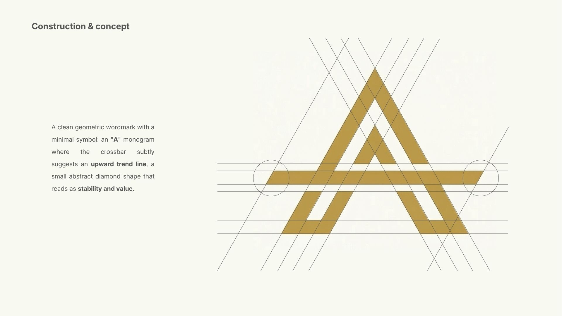
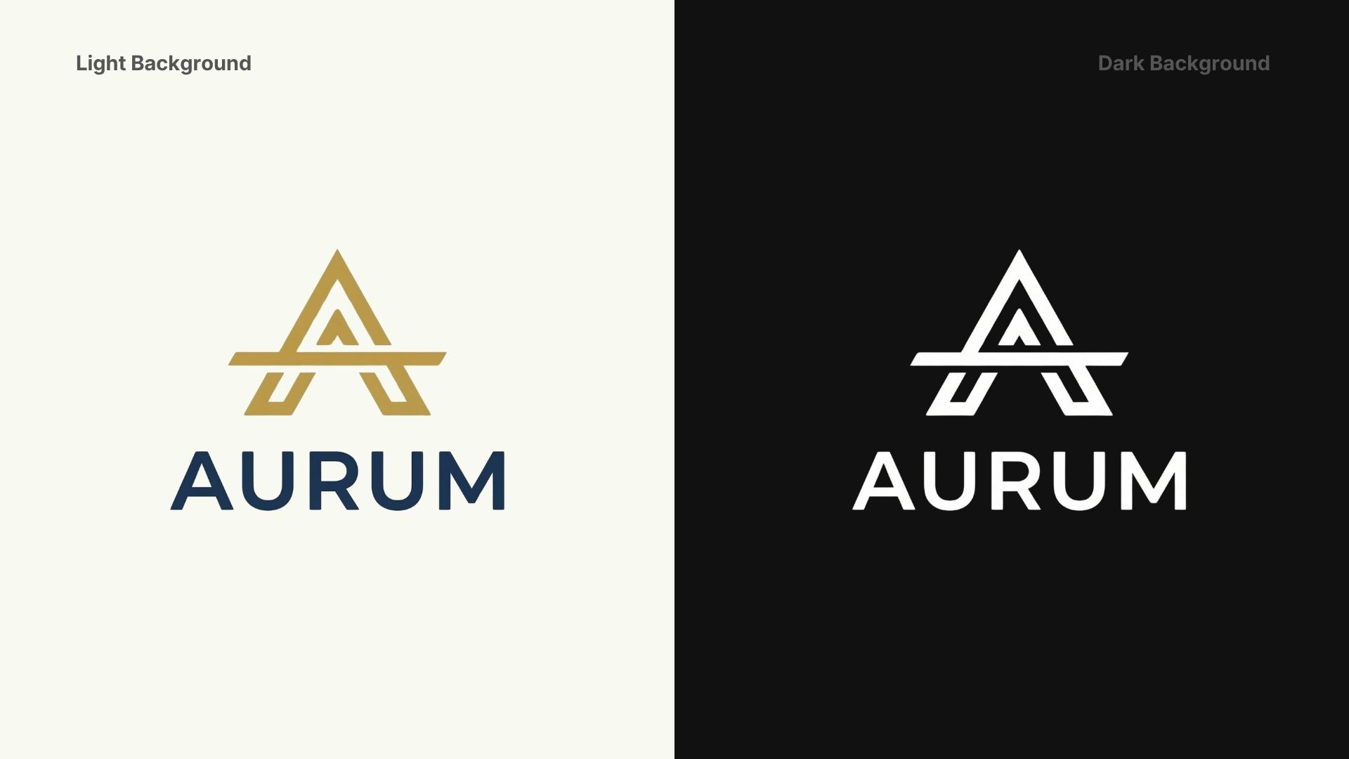
Aurum needed a brand identity that could sit comfortably inside a Fortune 500 CFO's dashboard — authoritative without being cold, modern without being trendy. The name (Latin for gold) anchored the direction: timeless value, precision, trust. No visual clichés — no coins, no upward arrows, no generic blue gradients.
The mark is a geometric "A" where the crossbar is replaced by a single horizontal rule — evoking a balance sheet line, a horizon, stability. The wordmark uses DM Sans weight 500: technical enough to feel like software, refined enough to feel like finance. The palette pairs deep navy with restrained warm gold — wealth implied, never stated.
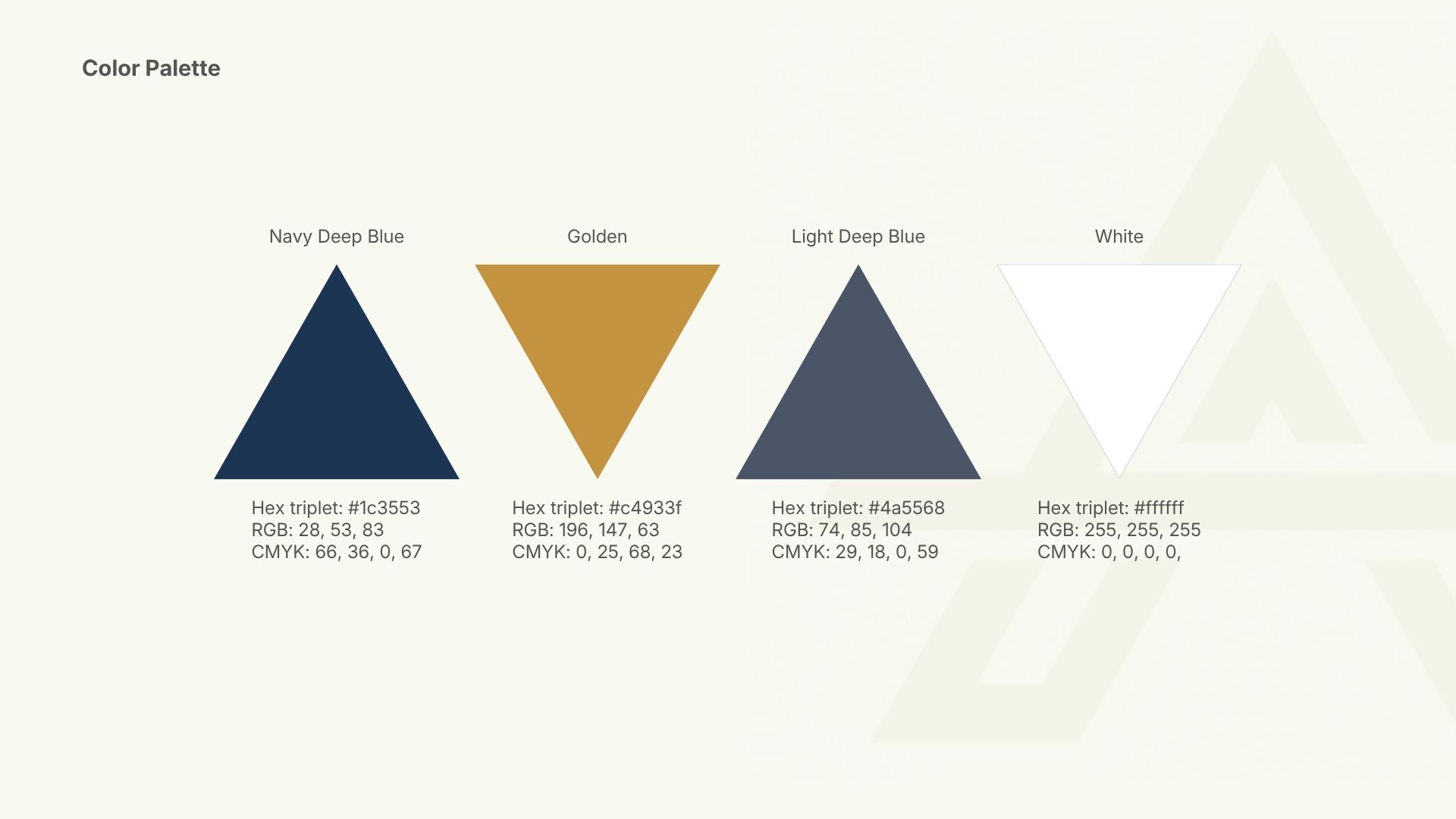


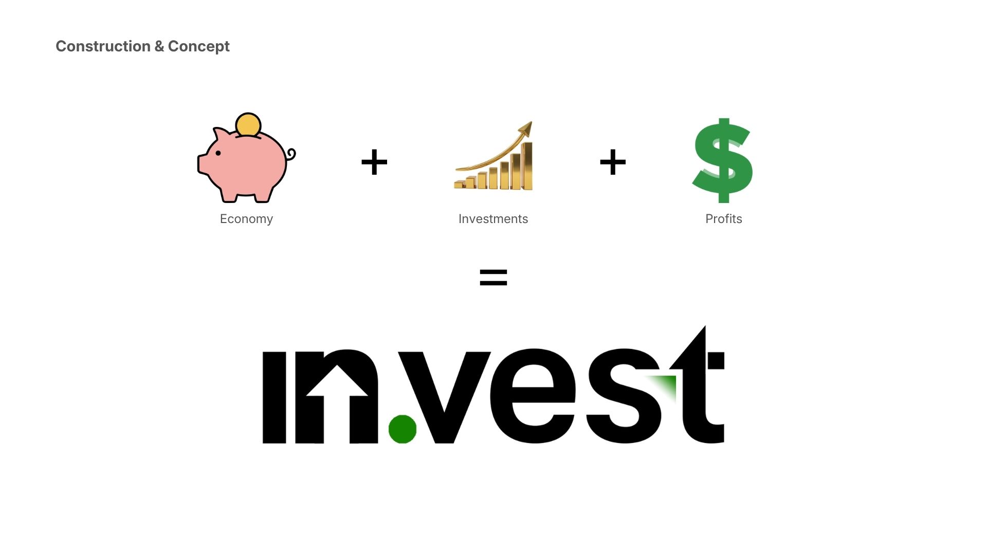
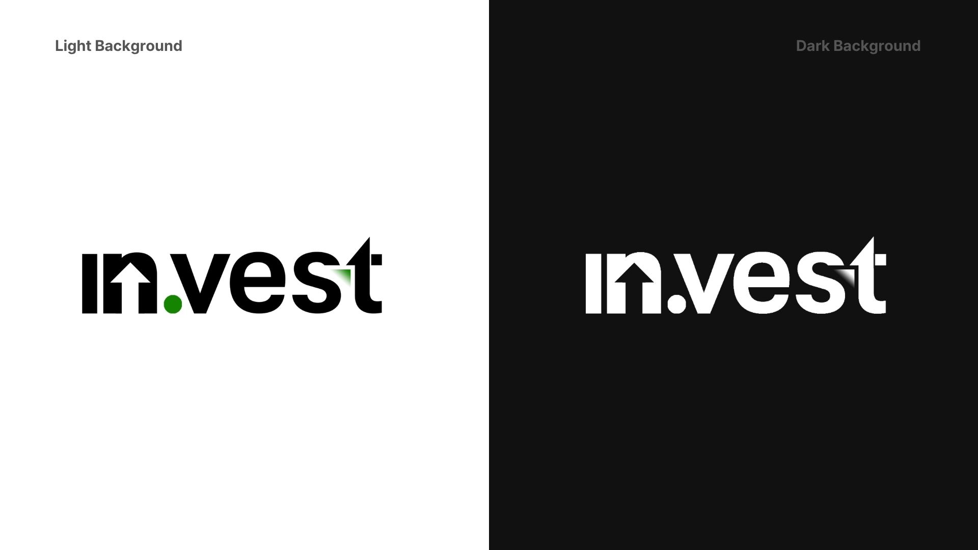
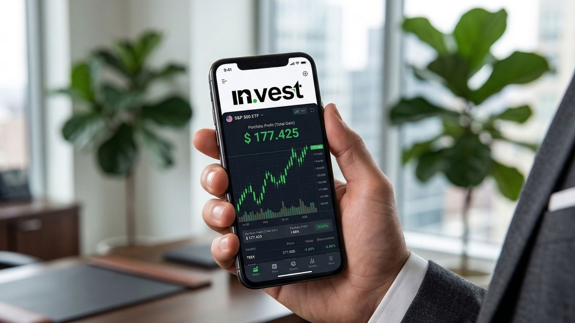
in.vest needed a wordmark that communicated two things simultaneously: the product name and its core promise. The brand had to feel modern, credible, and self-explanatory — a logo that a first-time investor and a seasoned trader could both trust. The constraint: no illustrations, no charts, no literal financial metaphors. The concept had to live entirely inside the letterforms.
The name itself is the idea: in.vest = invest. The period is the pivot — splitting the word into a command and a destination. The upward arrow hidden in the counter of the "n" rewards closer inspection without demanding it. It reads as a clean wordmark first; the hidden meaning surfaces on second look — the same relationship a good investment has with time. The green dot replaces the period separator, adding the only colour accent in an otherwise monochrome mark.

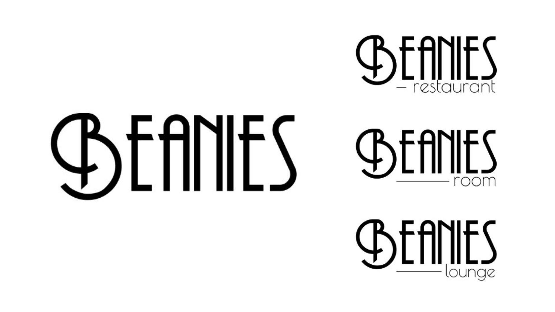
A fresh, healthy food concept needed a logo versatile enough to anchor three venue types — Room, Restaurant, Lounge — under one parent identity. Inspired by art nouveau's organic forms, the mark feels vibrant and timeless simultaneously, scaling from print menus to door signage to merchandise without losing its character.

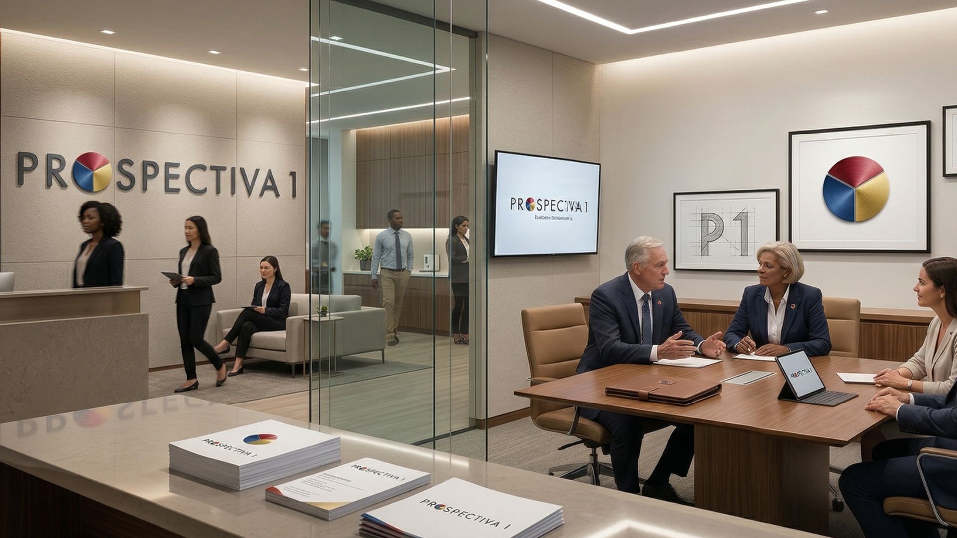
Public and private sector consulting firm. Brief: modern, professional, values-driven. The tricolor "O" encodes innovation, collaboration, and sustainability in a single memorable mark.
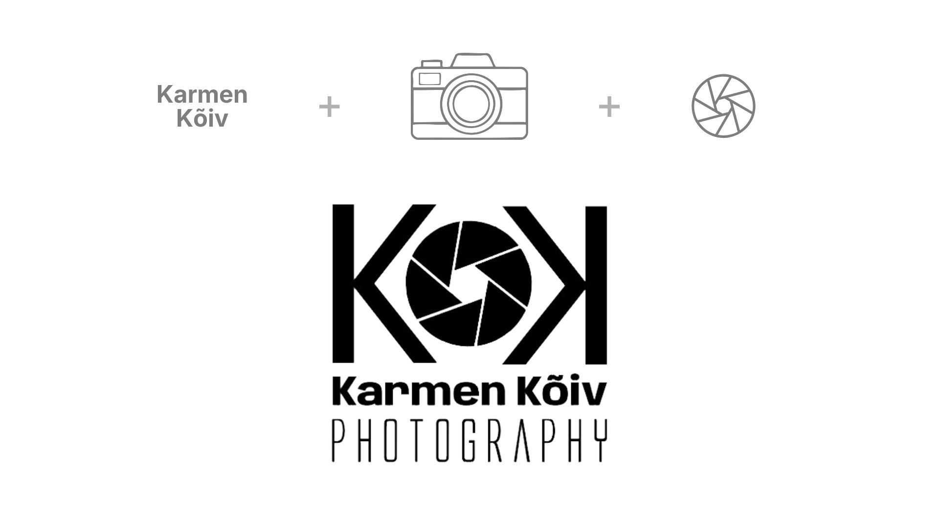
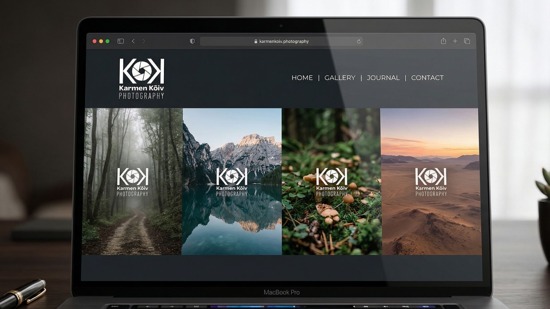
Professional photographer identity. The camera aperture integrated into the "K" makes the subject inseparable from the craft — a mark that works as both wordmark and icon.